As I mentioned last time, in today’s entry I want to shift away from the puzzle aspects to focus on the visual side of things. The overall aesthetic of Station Zeta is a very retro, pixel-art presentation, but that’s not the visual part I want to focus on. Instead, I want to dig into the thought process that went into developing Zeta’s visual vocabulary.
For as long as I’ve been thinking critically about games, one thing that always weighs heavily on my mind is how easy a game is to parse, visually. Perhaps it stems from my earliest video game experiences, which were all either monochromatic Apple IIe experiences (we didn’t get a color monitor until much later), or on the Intellivision.
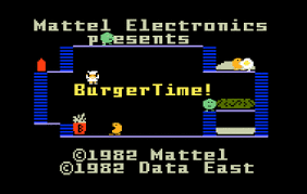
In both those cases, game graphics were defined in blocky chunks, with a limited selection of colors. While it might not seem like much to look back on, one thing it generally did very well was make it incredibly easy to read what was happening on screen. In Burgertime on the Intellivision, you can glance at the screen and pretty immediately understand what’s what. The walkable areas are clear, the ladders are obvious, and everything that’s moving (that isn’t you) is bad.
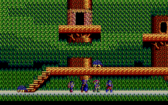
As we got into the NES era and early DOS games, most of these rules held true. But as graphics grew more advanced, I realized sometimes games that seemed difficult or bad weren’t necessarily either - they were just hard to read. A game like Sorcerian, for example, made it awfully hard to figure out what was what on screen when there was a lot happening against certain backgrounds.
As I got more into 4x games like Civilization and Master of Magic, the ability to quickly look at the screen and understand what was happening often made the difference between feeling like I was enjoying a game or not. If I had to stop and study a bunch of hard to understand icons against unclear terrain, I was probably not enjoying myself. (And no, I’m not even going to touch point-and-click adventure game visuals, which is a whole other article by itself).
Point is, as I started to do my own design work, making sure the player could clearly, quickly make sense of the game in front of them was paramount in my mind.
Picking a Palette
One of the first things was setting the basic rules for color and contrast with the level geometry. Things the player can walk on would be bright, things in the background would be dark. This isn’t exactly an incredible flash of insight, but it’s an important ground rule to remember.
That aside, the next step was figuring out the visual consistency I needed to maintain to meet my readability aims. Item one was the player sprite: how to make sure it was always easy for the player to see where they were on the screen.
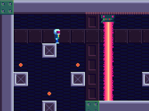
Color once again plays a huge part here. I had decided early on to restrict my graphics to a single 64-color palette to help emulate the retro feel I wanted. This was a bit of a double-edged sword as it kept me focused, but limited my overall choices. The primary effect of this being I couldn't make the player be an entirely unique color from anything else in the game.
That said, I made sure that the player’s head (the largest part of the sprite) was a color that would never be shared with the background. Also that was a nice high contrast against any possible background colors it might be in front of. As a final detail, the purple of the visor is a color used almost nowhere else, giving another slight visual cue to draw the eye.

On the flip side, enemies follow a similar line of thinking. The slower, less dangerous robots are bright, contrasting colors with the background. The more dangerous robots (the laser-firing Shootybot and the speedy, shielded Saucerbot) are both red. This helps keep them visible and highlights their increased threat.
The other environmental hazards share similar rules. The things that can kill you instantly (Plasma Beams and Laser Barriers) both share the same pink/purple hue. Very bright, impossible to miss, and consistent in indicating “danger.” Acid pools and acid drops as well share the same neon-green to make it clear they are related and equally dangerous.
Your Place In Space
Color aside, the bigger issue I wanted to tackle was not just letting the player understand where they were in the world, but how all the things in the world around them related to one another. Being a puzzle-platformer, if the player can’t understand what’s happening with the puzzle part, well… they won’t be a player for very long.
In many cases, the easiest answer is simply having things that relate to each other near to one another. Having a button directly next to the lift it operates is obvious. The proximity is an immediate indication of what is likely to happen, and as soon as the player presses it the results are obvious.
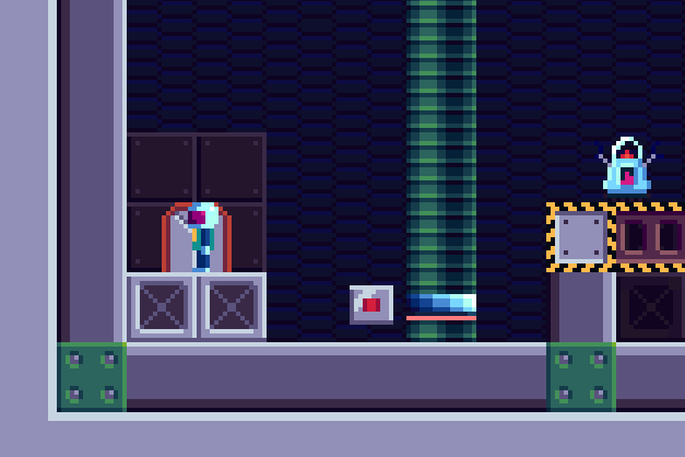
Where things get trickier are when the triggers and their objects aren’t close to each other, which is often. For those instances, where I felt it might not be immediately clear to the player what the switch they were operating was doing, I wanted to provide a clear visual link to help clue them in. This lead me to the idea of the “conduit” graphic, which became my go-to for indicating the relationship between objects that could be turned on and off.
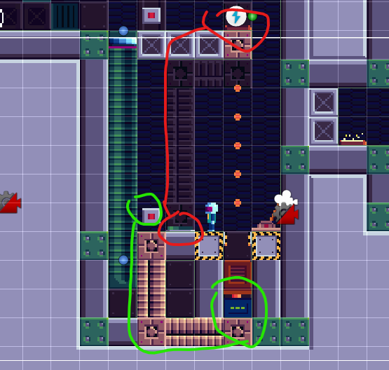
In this example from the level “Launch Box”, you can see the conduit idea in action in a more complex scenario. In this case, we have two triggers (the button and the pressure pad) right next to each other, with several objects nearby they could impact (the teleporter, the piston, and the trapdoor). While I could certainly let the player stumble around trying the buttons to see what does what, by giving the clear conduit paths as a visual between the objects, this will hopefully spare them some needless frustration. This is especially vital because, when actually playing the level, the teleporter is just offscreen if the player is standing on the button (and doesn’t use the “glance up” control).
Beyond the switches, I wanted to incorporate some other similar visual cues to help guide the player along. Platforms all have a background track that gives a clear indication of their travel path. This helps ease those situations where players might miss a jump because something didn’t go as high or as far as they expected.
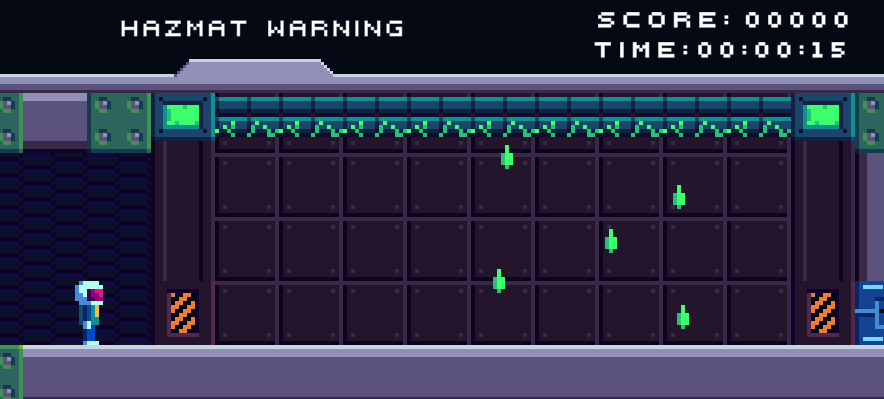
Some more subtle clues are the use of “hazard” stripes to indicate high-danger areas. In the area below, for instance, in case the glowing green acid drops weren’t warning enough, the hazard slashes should hopefully stop a player from charging into their death at full speed.
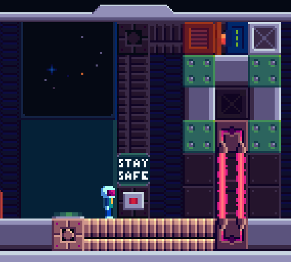
Similarly, the “Stay Safe” sign is a subtle warning to the observant player. They are generally an indicator that something is possibly about to fall on your head, or shoot you, or both. Again, the intention is for the player to notice these little details as they encounter them early in the game, and as they get into more dangerous, complicated territory later it shouldn’t even be something they have to think about.
In the below example, we have a nice double-whammy of conduits and the “Stay Safe” warning to make it abundantly clear what’s going to happen when they push that button.
The readability of games, to me at least, is one of those things that can make or break them. Sometimes it's as obvious a problem as sprites getting lost on backgrounds, but sometimes it's more subtle issues that add up just enough to trip up a player.
What I've discussed above are a few of the primary ways I aimed to build a visual vocabulary for the game in the hopes of addressing those issues. Between the use of color, location, and visual cues, it’s my hope that a player sitting down to spend some time with Station Zeta will be able to spend as little time as possible trying to understand what’s happening on screen, and more time focusing on having fun and going fast.
And, it just so happens, going fast will be the focus of my next devlog, as I go over some of the ideas I put in place to encourage and assist speedrunners.
In the meantime, make sure to pop over to Steam and wishlist Station Zeta today!
Run, jump, shoot, and think your way to safety in this retro-inspired 2D puzzle-platformer. Station Zeta is out of control, and you'll have to deal with crazed robots, terribly designed station machinery, and blatant safety hazards as you try to make your escape across over 35 levels.
<p>
    <a href="https://store.steampowered.com/app/2950320/Station_Zeta/">Station Zeta on Steam</</a>
</p>